



Saka Aji Photography - Logo Design & Visual Identity
Project Description
Saka Aji Photography is a logo design and visual identity project created for a photography brand focused on capturing meaningful moments, stories, and emotional connections through photography.
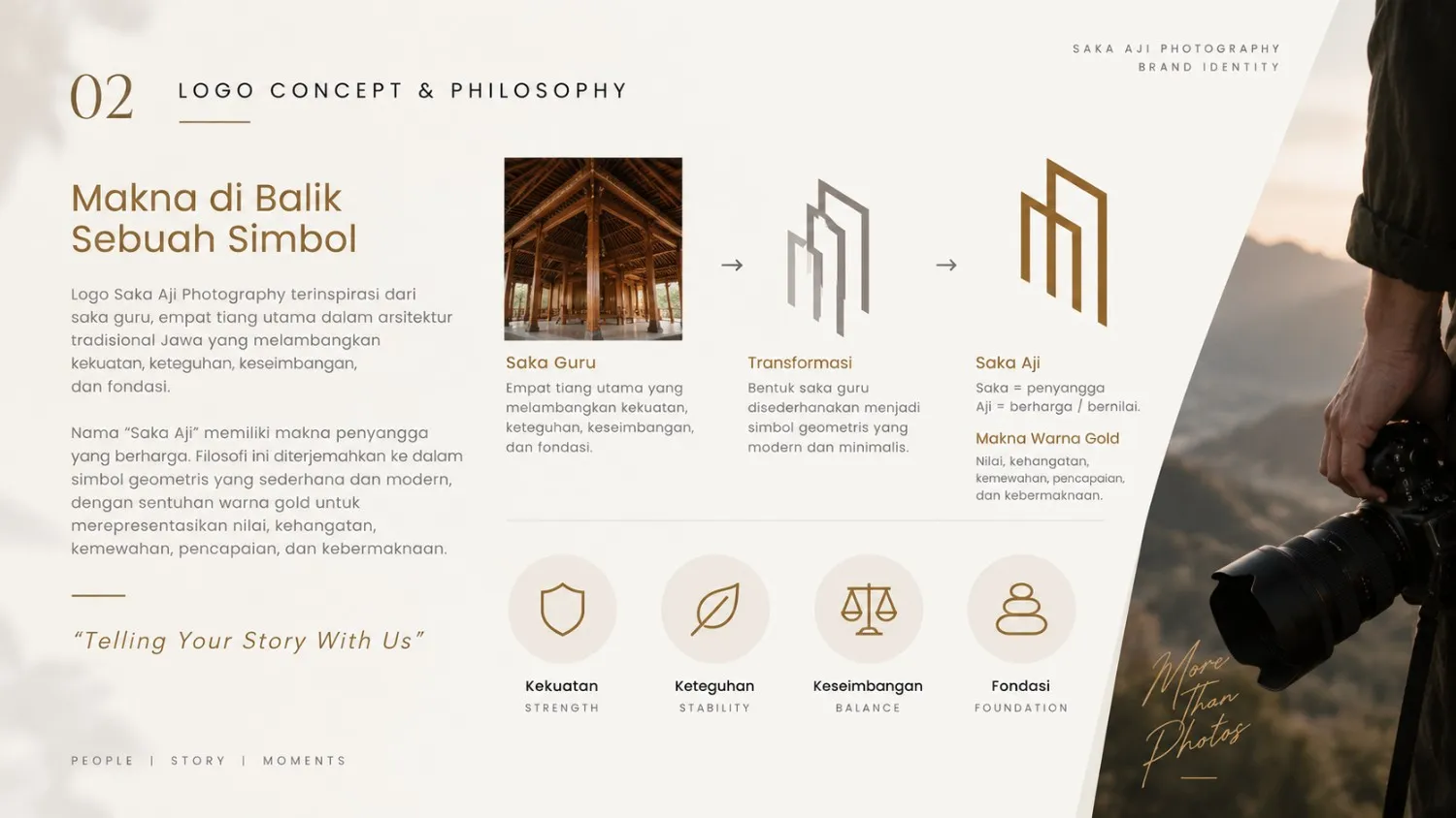
The visual concept is inspired by the Saka Guru, the four main supporting pillars found in traditional Javanese architecture, representing strength, stability, balance, and foundation. This architectural element was translated into a simple geometric symbol with a contemporary visual approach while maintaining its cultural connection.
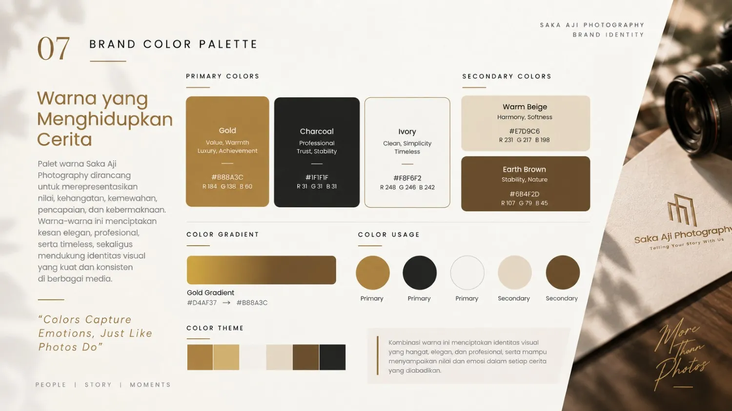
The name “Saka Aji” also plays an important role in the concept development. “Saka” refers to a supporting pillar, while “Aji” carries the meaning of something valuable or precious. These ideas are complemented by a gold color palette, representing value, warmth, elegance, achievement, and prosperity.
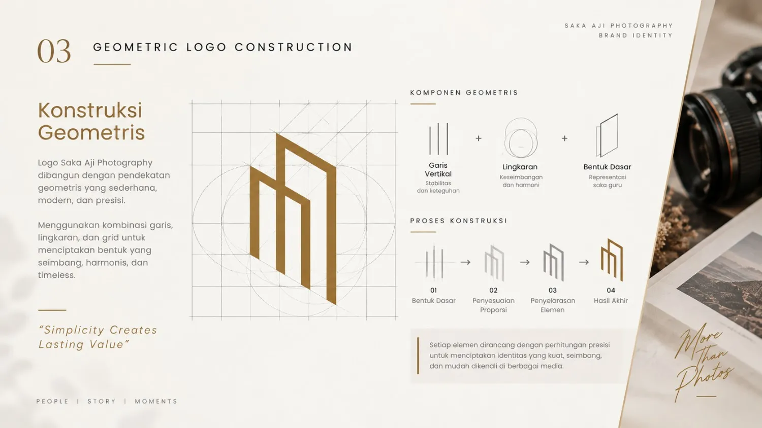
The logo was developed with a minimalist, elegant, geometric, and timeless approach, allowing the identity to remain distinctive and versatile across different applications.
The visual identity system includes:
- Primary and secondary logo
- Logo concept and philosophy
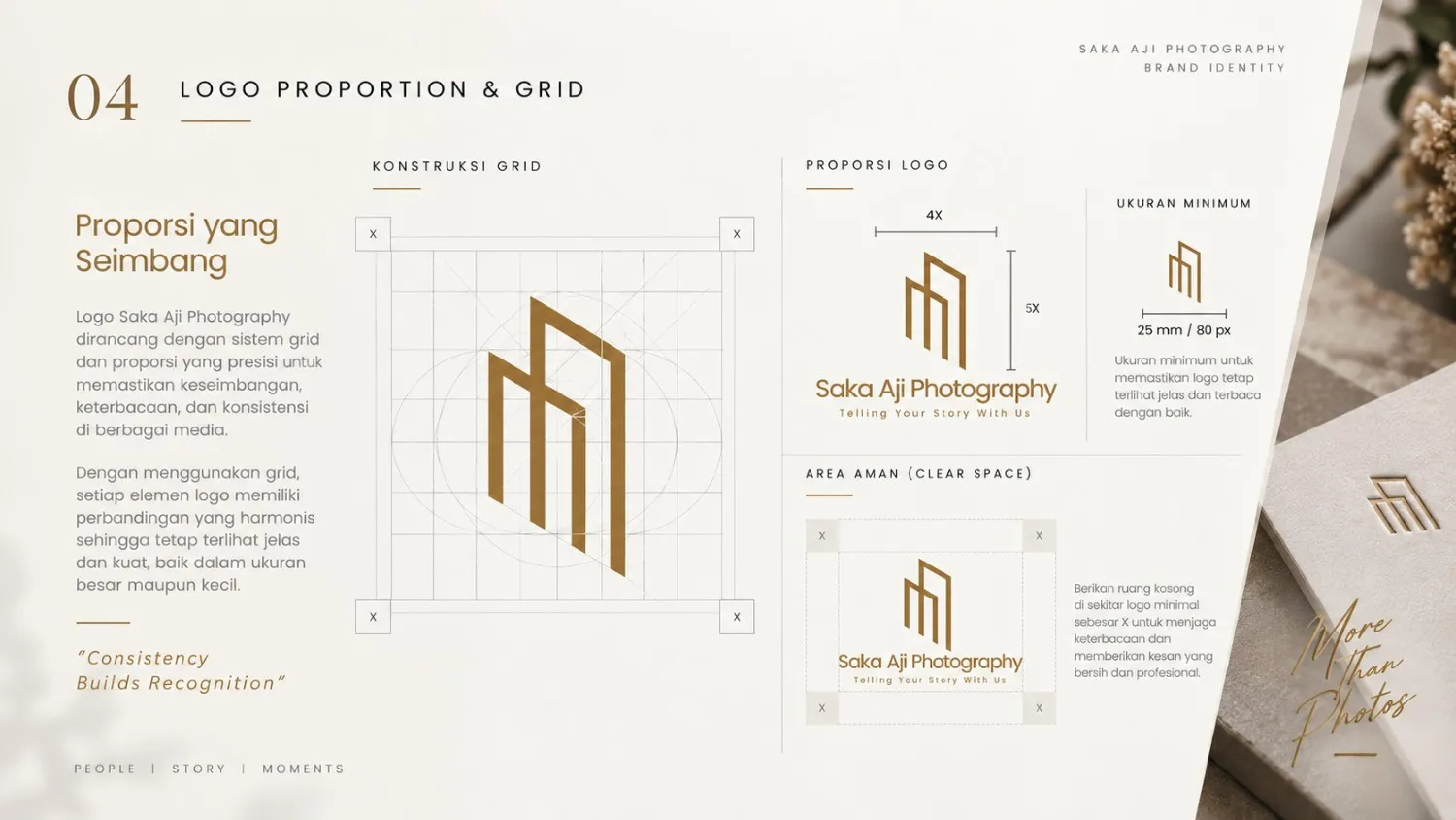
- Logo construction and proportions
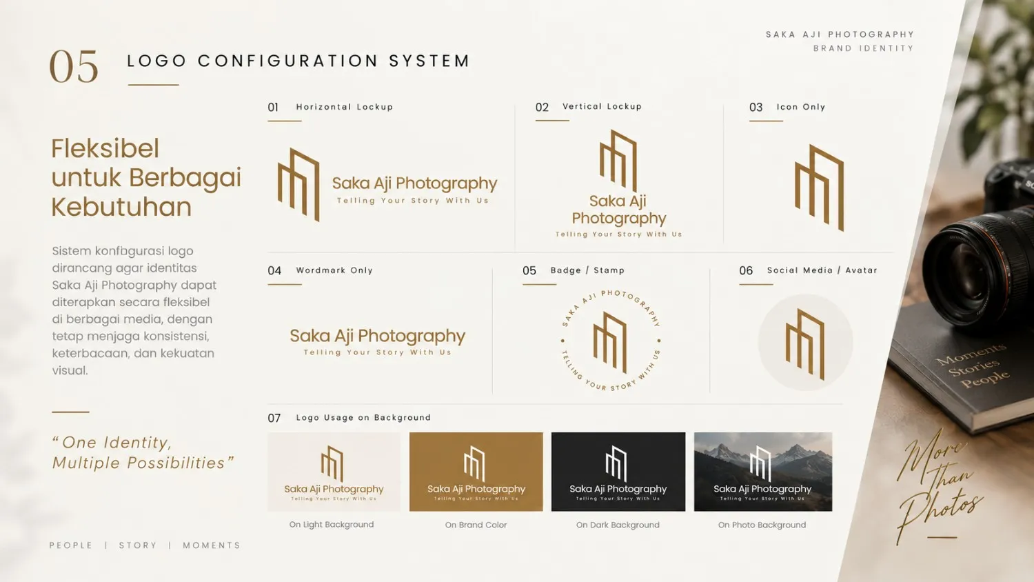
- Logo configuration system
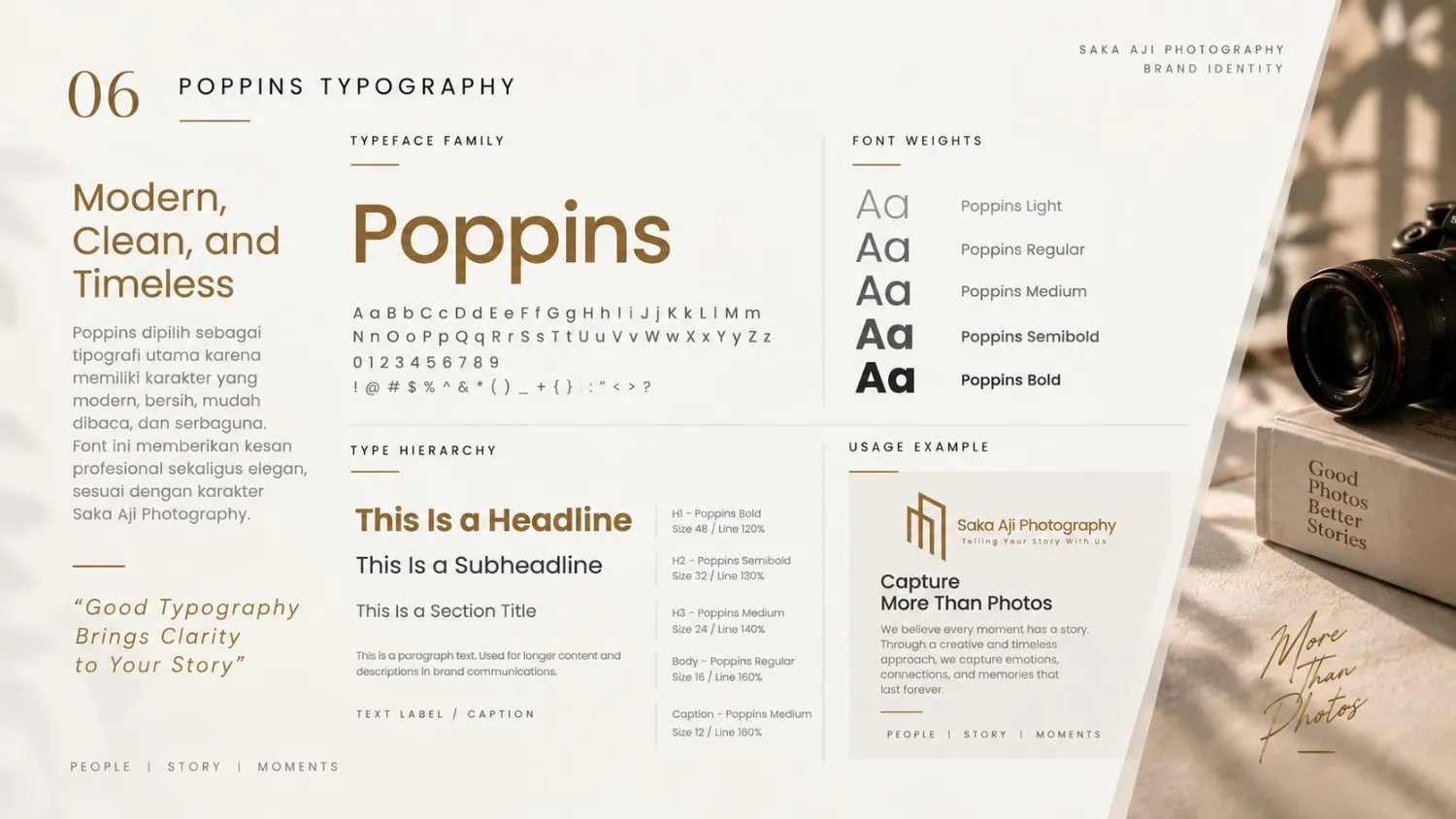
- Typography using Poppins
- Brand color palette
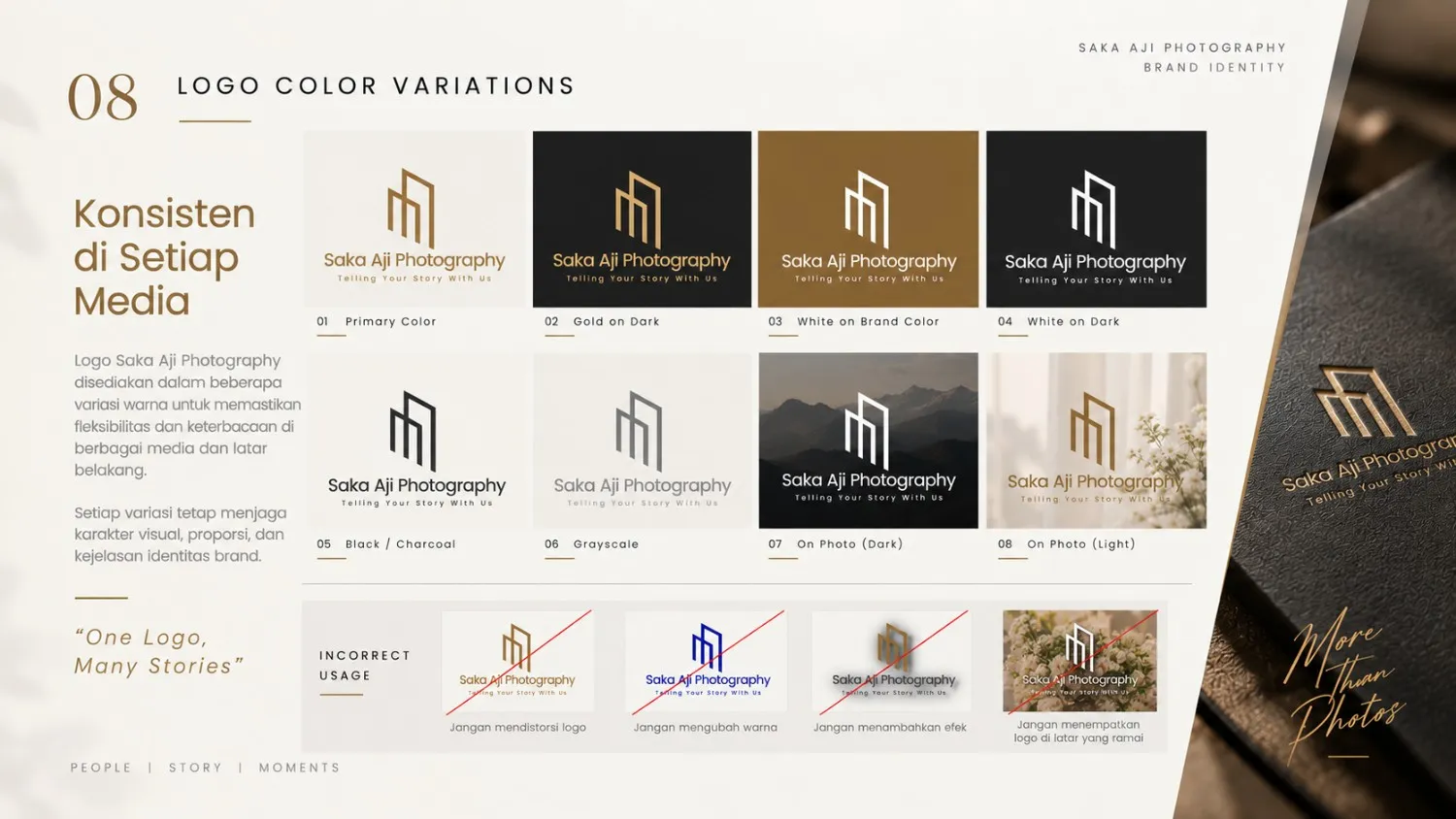
- Logo color variations
- Photography-based applications
- Business card design
- Visual presentation and brand guidelines
Overall, the Saka Aji Photography identity was designed to communicate a sense of elegance, warmth, professionalism, and character, while positioning photography as a medium for preserving stories and meaningful moments.
Tagline:
Telling Your Story With Us
Project Details
Want to create a similar project?
Consult Now