PKBM Mandiri Sejahtera - Visual Identity & Logo Design
A visual identity project created for PKBM (Community Learning Center) Mandiri Sejahtera, an organization focused on education, community empowerment, and continuous learning through an inclusive and accessible environment.
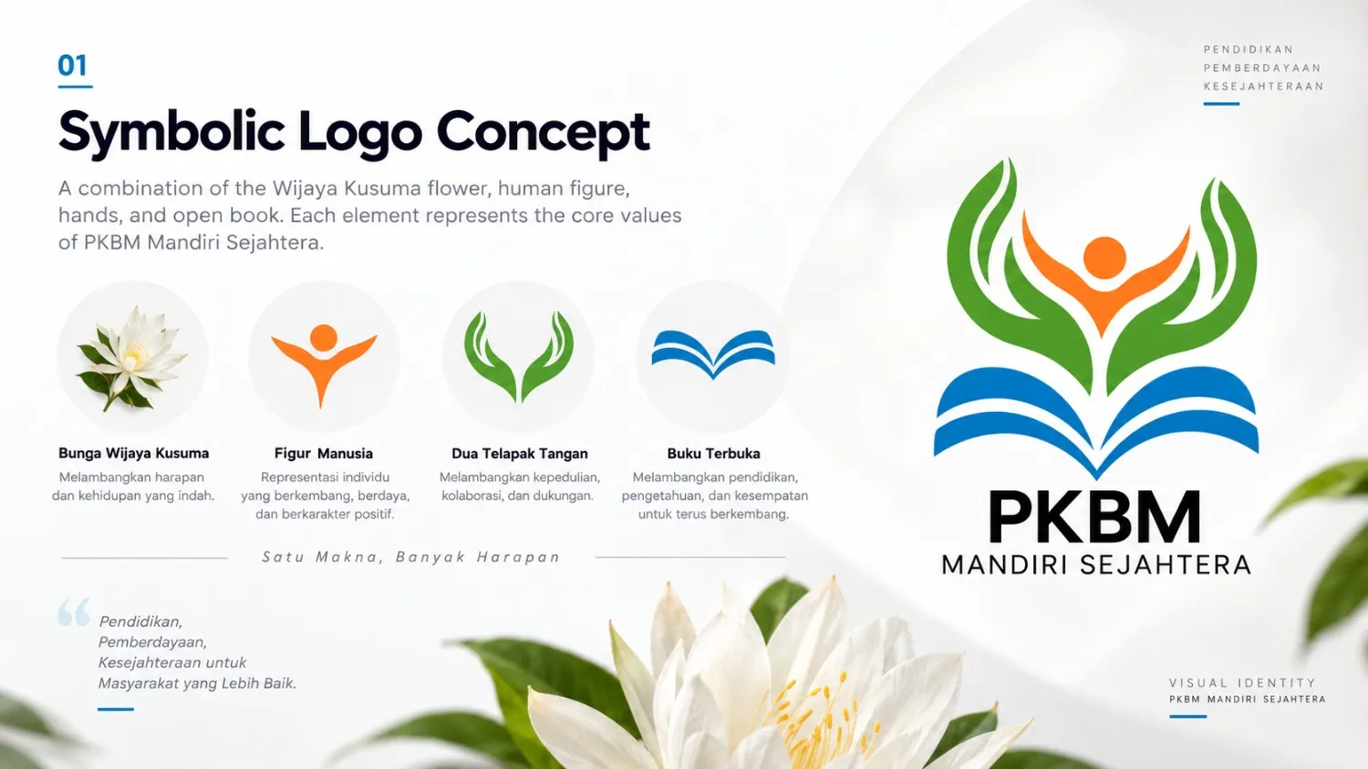
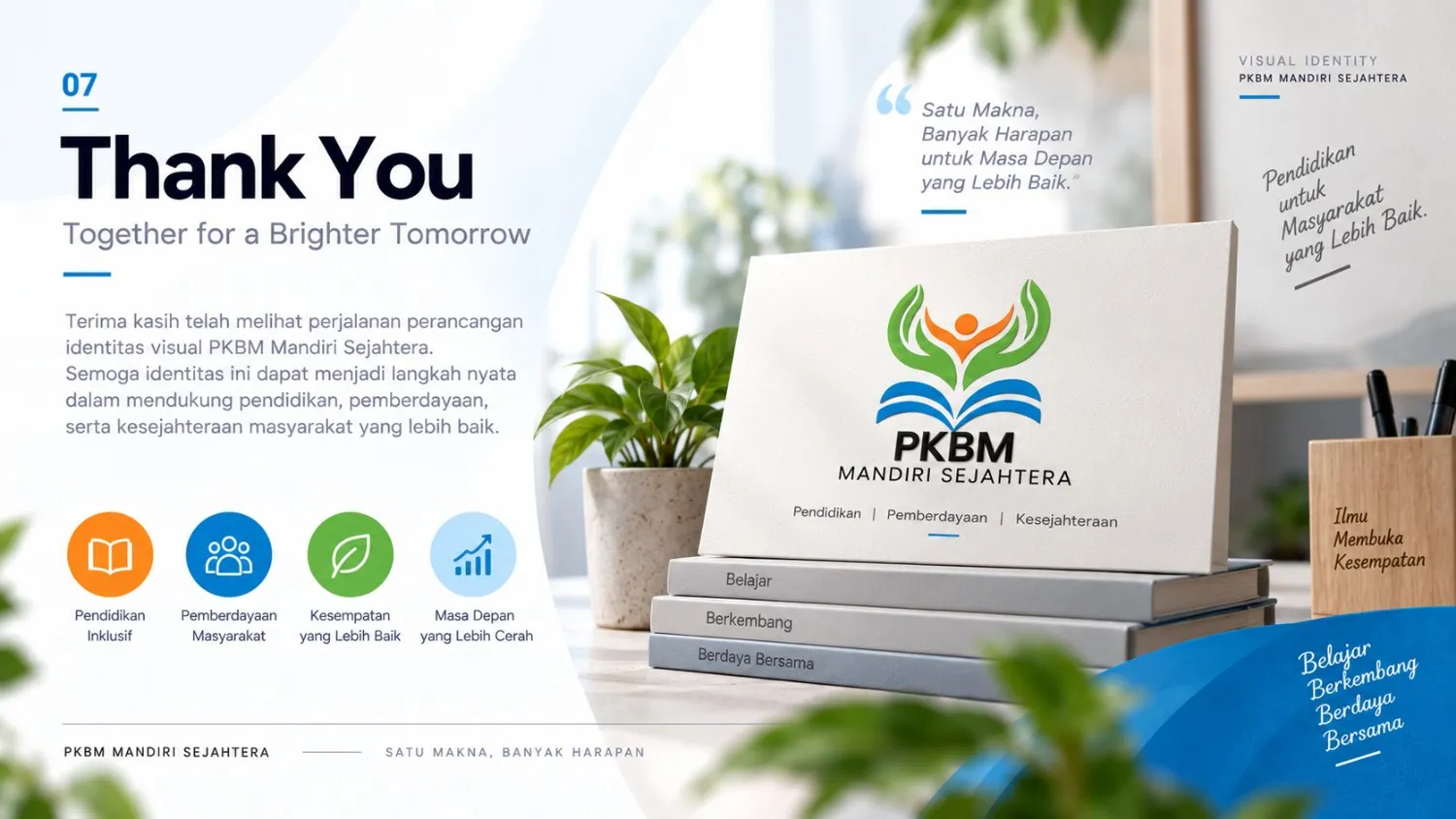
The logo concept combines several symbolic elements that represent the core values of the organization. The main form is inspired by the Wijaya Kusuma flower, symbolizing hope and a beautiful life. At its center, a human figure represents individuals who continue to grow, become empowered, and develop positive character.
The lower visual elements combine interpretations of two caring hands and an open book, representing care, meaningful work, education, knowledge, and opportunities for continuous growth.
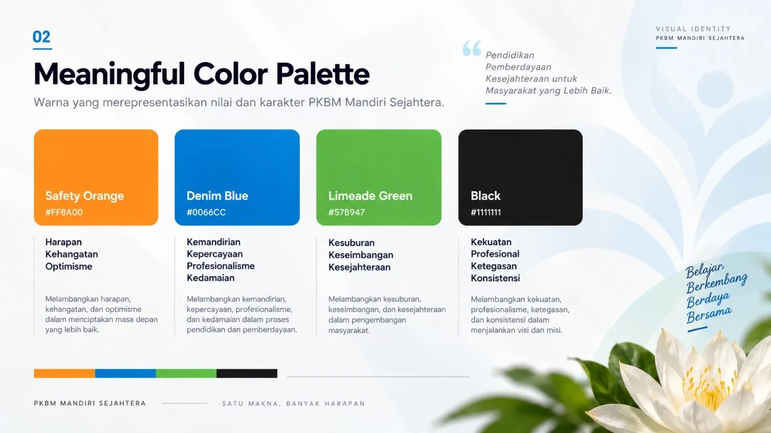
The visual identity uses a distinctive color palette consisting of Safety Orange, Denim Blue, Limeade Green, and Black. Orange represents hope, warmth, and optimism; blue represents independence, trust, professionalism, and peace; while green represents growth, balance, and prosperity.
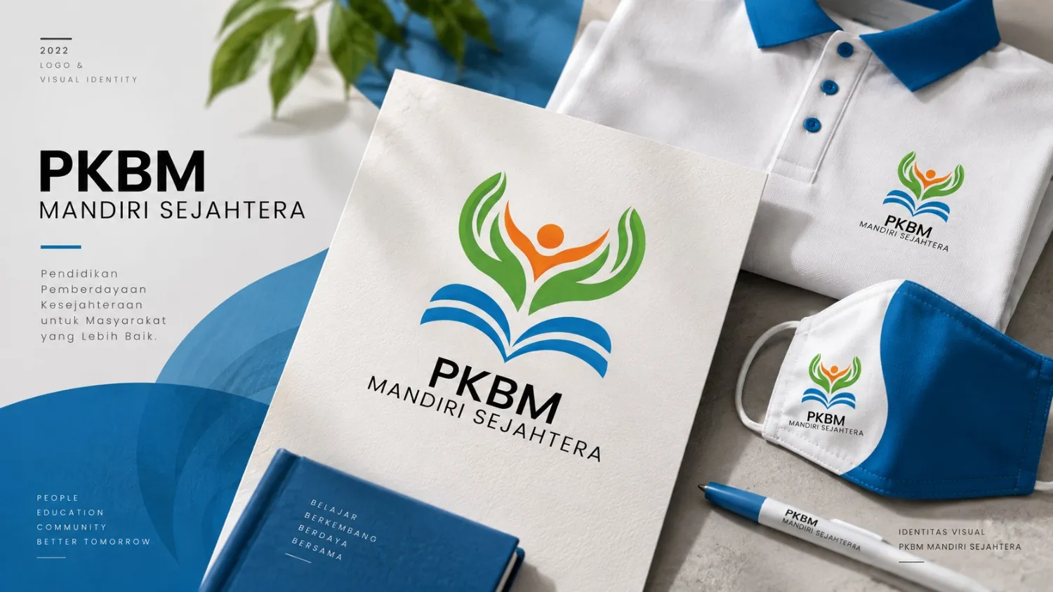
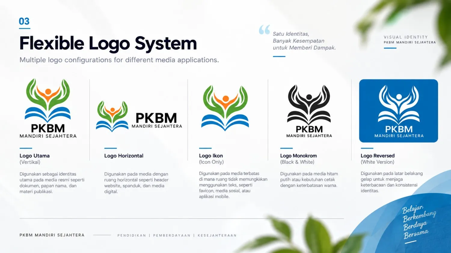
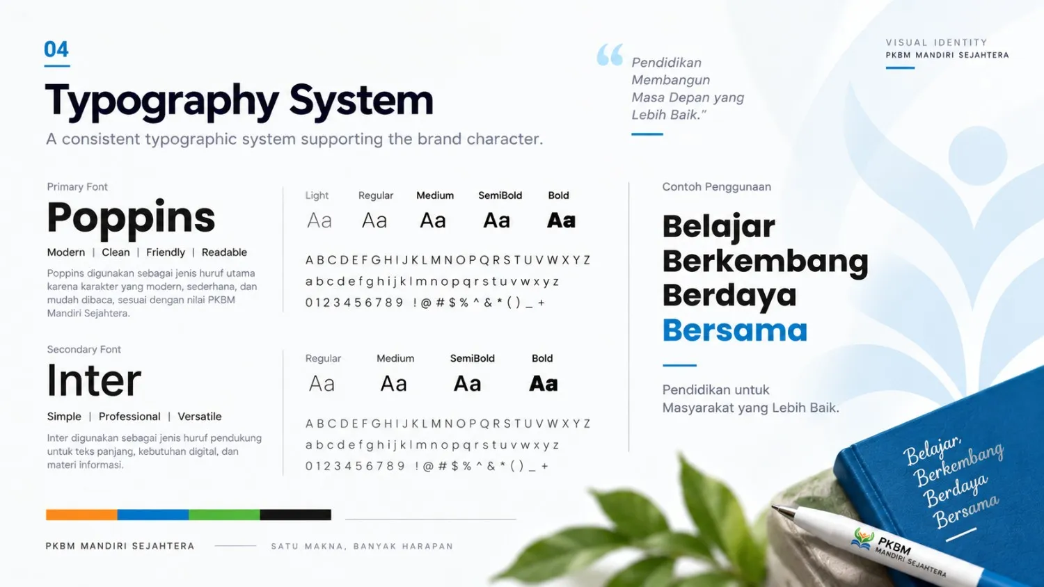
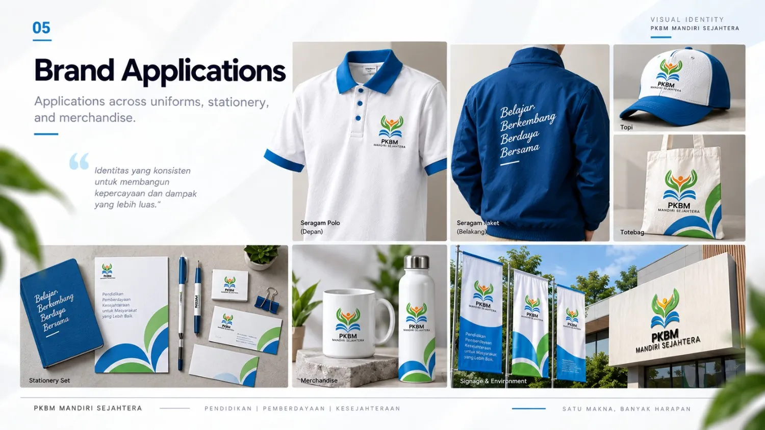
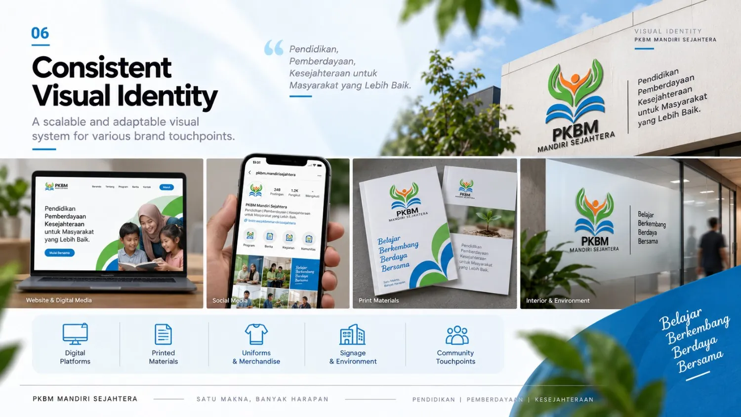
The identity system was further developed into multiple logo configurations, typography, and practical applications across uniforms, stationery, and merchandise, creating a cohesive and adaptable visual language across different communication media.
Project Details
Want to create a similar project?
Consult Now